
SUNY Orange Art Show Poster Designs
Print Design, Art Direction
Credits
Graphic Design, Art Direction — Brandon Diaz, in collaboration with SUNY Orange Art Department
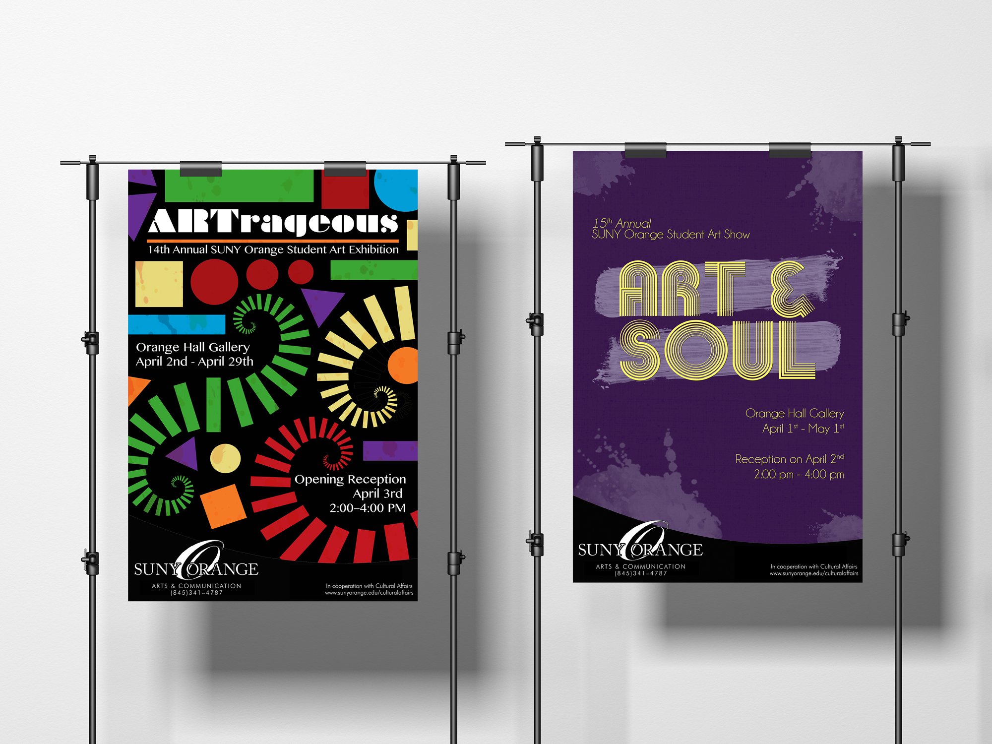
The two poster designs below were created as part of an annual art show held at my previous academic institution. Each year the school's graphic design and art students come together to develop multiple posters advertising that year's art show and its associated theme. In 2018, the show's theme was "ARTrageous," with "Art and Soul" serving as the show's primary subject the following year.
The initial inspiration for my "ARTrageous" poster design was the opening title sequence to Disney and Pixar's Monster's Inc. The opening sequence to the film incorporates a lot of neat stylized and graphic elements that I thought not only matched the theme of the show but would visually translate well when in print form. In its current iteration, I can't help but feel as though the design of this poster works well in playing with the outrageous terminology featured on the flyer. Additionally, there's a sense of visual fluidity expressed through the arrangement of shapes in this design that surprisingly works well in capturing excitement without overwhelming the viewer in chaos or clutter. These aspects highlight themselves further in the poster's utilization of bright color, which displays itself in a z-pattern that guides the viewer's eyes left to right and top to bottom against the dark backdrop of the design. Finally, in providing cohesion, the typeface used in the poster's title is also geometric, which ties the design together. In ensuring this information stands out from the other colors presented, the typographic elements are in white, adding contrast without seeming disruptive.
With "Art and Soul" being the theme of the second poster, I decided to go a much more simplistic route with my design, inspired by Motown and jazz iconography. As opposed to incorporating a multitude of vibrant colors, I stuck to a complementary color palette of purple and gold, with purple serving as the primary anchor color within the poster’s background and yellow serving as the main color for the foreground and the design's typographic elements. As a result, this design appears much more precise, professional, and dare I say it, mature from a viewer's perspective. The title is the primary design element of this poster, displaying itself in a geometric sans serif stencil typeface that plays into the art show's theme well. In guiding the viewer's eyes, the typographic content of this poster is positioned in a diagonal line that reads left to right for better legibility. Like the title, these informational bits are also presented in sans serif typography, though they are noticeably more straightforward and less geometric in their appearance. In adding interest and dimension to the piece, I included some paint splatters and brush strokes to further play into the "art" theme, that when united with the other elements of this design, unify to become "art and soul."


